JustPark - New Checkout

Intro
Since 2006, JustPark’s mission has been to make parking simple by connecting drivers who need parking with people who have spaces. Today, over 10+ million drivers enjoy simpler parking with JP and over 25,000 space owners have turned their driveway into a new source of income.
One of the solutions that JP provides is long term parking and monthly bookings. The web the checkout for these type of bookings was underperforming. It had a below average conversion rate and something needed to be done in order to improve it.
Identifying the problem
We started this project with the assumption that the main issue was the cancelation policy. We thought it was not clear enough and made people scared of committing to a long term booking.
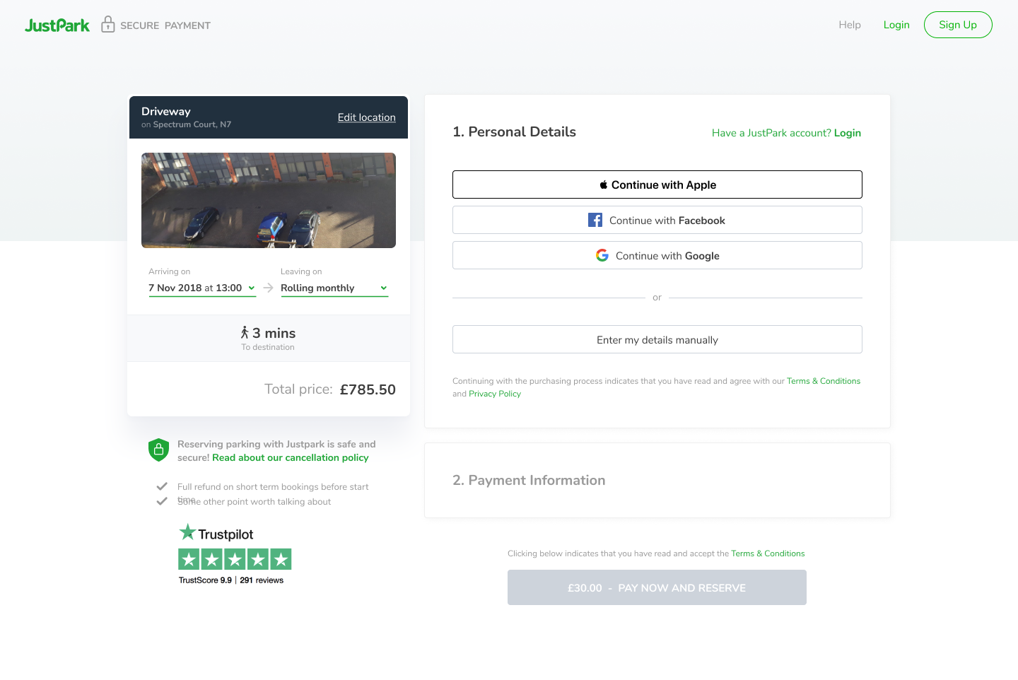 This was the original checkout. Functional but far from perfect in terms of information structure and clarity
I decided anyway to set a round of interviews with stakeholders from various teams to better understand the problem as this was my first project at JP and was still lacking key insights about the product and habits of our users.
The overall consensus was the cancelation policy wasn’t well placed in the checkout and also diverted the users from the checkout page on to another page where this policy was better explained.
Validating assumptions
I started this project with some goals in mind apart from improving the cancelation policy.
The design of the checkout section was a bit outdated and wasn’t created to support the long term bookings so when JP decided to enable this feature, the relevant data wasn’t nicely supported and that resulted in a less optimal experience for users thus not being optimised for conversion.
It lacked clarity, had not crucial information in such an important step and the layout could been improved to provide an overall better experience, quicker and with more confident.
With this in mind, I decided to create a couple of prototypes and schedule some user interviews to validate all these changes.
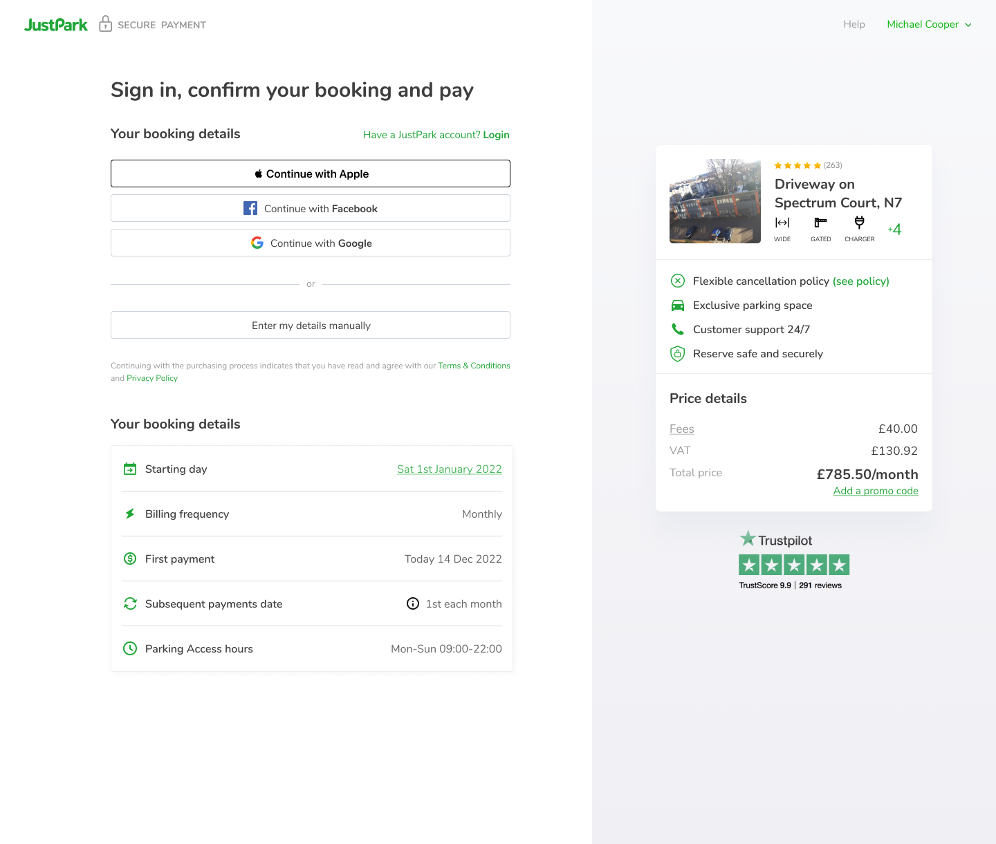 The best performing amongst the prototypes that users went through
In these interviews I presented users with a task: Find and book a monthly parking space.
This will allow me to see on what areas are they focusing their attention, ask questions and see, once they reach the checkout step how much of an improvement these prototypes were.
I discovered that our users don’t care that much about the details of the cancelation policy but instead that there was one in place, so the sole mention of this policy was enough for their peace of mind.
Payments were the topic more confusing for them. They were mostly interested about the billing cycle and when payments will be collected.
The new layout shown in the prototypes, with the information clearly stated, removed the guessing work and increasing their willingness to commit to the parking space for a long term period.
Solution
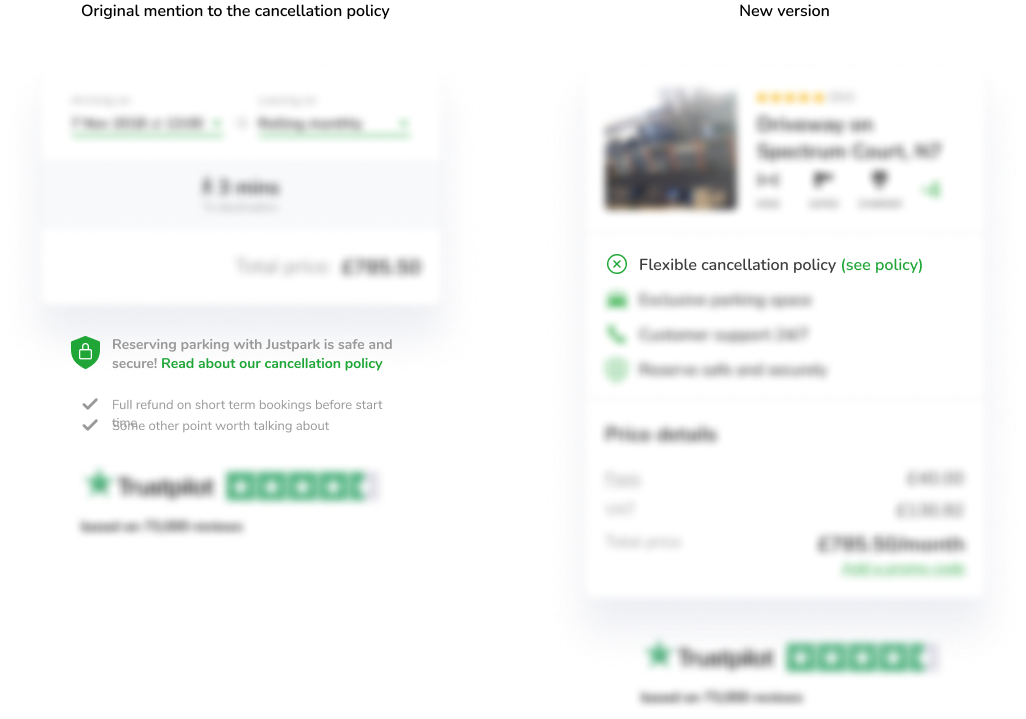
After all the research and prototyping phase, I focused my efforts implementing the feedback from our users and aligning the checkout visual design with the rest of the platform, as it was using an old visual style.

It was a complete overhaul of this section, looking more modern and connected. Keeping only the bare minimum information to reduce the cognitive load and churn ratios and making the booking details easier to digest.
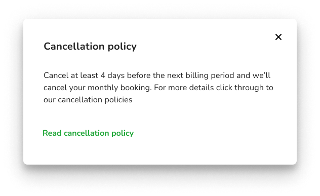 Clicking on the cancellation policy link will show a modal instead of breaking the checkout flow
Implementation and Results
We decided to take a 3 step approach for the deployment of this project. We started with an A/B test of 50% of the users that visited the checkout after choosing a long term or monthly booking.
After seeing an improvement on the conversion rates of users seeing the new checkout, we rolled it out entirely for long term bookings. At this stage, the conversion rate increased 23% from the previous version.
Eventually and after adapting the checkout for one time bookings, we rolled it out entirely, resulting in a total increase of 24% above the previous version.